DarkMode UI — Component Kit with Dark + Light Theme (HTML/CSS/JS)
New here? Create a free account
- Downloads
- 0
- Category
- UI Design
- Last update
- Oct 07, 2026
- License
- MIT / Free use
About this code
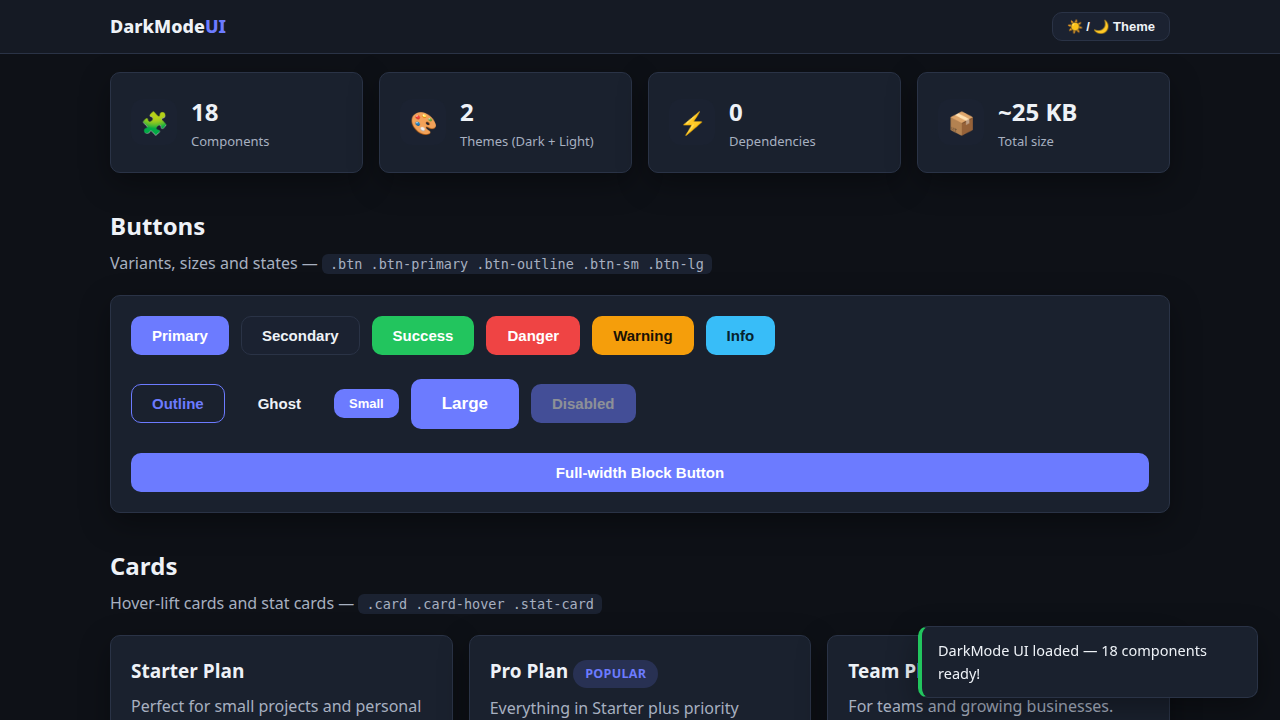
DarkMode UI is a free, lightweight UI component library built with pure HTML, CSS and vanilla JavaScript — no frameworks, no build step, no dependencies. It ships dark theme by default with a one-click light theme, so your website looks modern instantly. Drop components.css and components.js into any project and start building with 18 ready-to-use components: buttons (6 variants + sizes), hover-lift cards, stat cards, form inputs with validation states, checkboxes, radios, toggle switches, badges, dismissible alerts, modals, toast notifications, tabs, accordions, progress bars, striped/hover tables, avatars, pagination, tooltips, spinners, breadcrumbs and layout helpers. All colors are CSS variables, so you can rebrand the entire kit in minutes. A live demo page (index.html) is included so you can see every component working before you copy it. Free for personal and commercial use, no attribution required.